Introduction: Not knowing anything about shopping for baby clothes or the amount of money new parents spend on clothing for their baby, or even how fast babies actually grow within their first 24 months of life… My team and I were tasked with creating an app for the new Vancouver start-up company ‘Tradle’.

What is Tradle? Tradle is a subscription service for baby clothing (0–24 months) but unlike other subscription services, Tradle prides itself as being a “sustainable” and “eco-friendly” clothing exchange service.
“What if there was a way to buy eco-friendly, affordable, & high-quality clothing for your infant — all without having to visit a single store?”
Tradle offers it’s customers three different “bundle” options (New, Gently Used, and Community Contribution). Each bundle includes twenty clothing items and the bundles are filtered by what season the customer would like (ie. summer, autumn, winter, spring). The customer also has the option to customize their own bundle.
Understanding the Challenge: Our challenge was to create an app for Tradle that would enhance the Tradle customer experience. During the initial stakeholder meeting our client expressed his needs, wants, and goals to us. He had three main goals that he wanted to see in the app.
-To see an itemized list of clothes in the current delivery package (with the ability to review, comment, and share feedback on the current clothes)
-To be able to easily request a clothing exchange (with the preferred date, time, and location.)
- To be able to customize the package of clothes in their next bundle (ideally, based on what is available in the inventory)
With these goals in mind our UX team started the research.
The Research: Methods used: organizational/domain research, survey, user interview, contextual inquiry, affinity mapping, comparative/competitive analysis, information architecture
Research Goals:
- Determine parents baby clothing shopping habits. What parents are looking for when they shop for clothing whether it is material, brands, environmentally friendly, price, etc.
- Determine how clothing subscription services are used and what the general user would like to see from a subscription service.
- Discover the motivations of parents who shop for their babies clothing ie, how much they are willing to spend, the inconveniences of shopping for clothing, do they shop for second hand clothing or receive hand-me-downs, etc
- Identifying the areas of improvement that subscription services could have (making users more keen to sign-up)
Our team was given some research that Tradle had previously conducted. We set out to conduct our own research by creating a survey via Google Forms and posting it to our social media platforms and a few groups on Facebook for ‘new parents’. As well, we conducted a few interviews. In the end we found that our data was very consistent with the data that Tradle had already given us.
Survey and Interview Findings:
“I like the the idea of a subscription service for convenience as well as reusing baby clothes”
The key findings in our survey’s were that most people found the cost, comfort, and size to be the most important factors for when purchasing clothes for their babies. The top must-have features that people would like to see in a subscription service were the sizing of the clothing being purchased to be accurate, the ease of returns and exchanges, and the ability to cancel the subscription at anytime. Almost everyone who was surveyed would like the option to select they next clothing bundle in their subscription rather than being given something random that the company had pre-made.
Affinity Diagram & Persona: With the gathered data collected from both our research and the research that Tradle had provided for us, our UX team created an affinity diagram that grouped and organized all of our research.
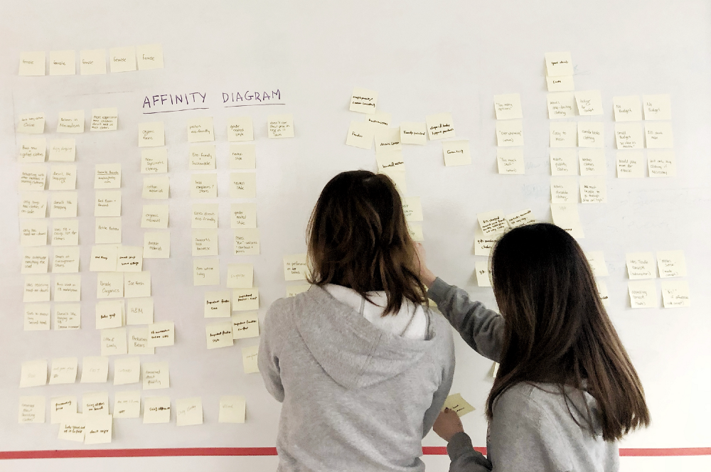
We grouped the gathered data into categories and then again into subcategories. Through the organization of this gathered data we were able to get a clear understanding of what our potential user would be. With that information we were able to create a user persona.
We created Carie York, a 31 year old environmental lawyer who just got back to work after being on maternity leave. Carie is our perfect user as she is a new mother and both environmentally conscious as well as on a time constraint. By using the Tradle app with her Tradle subscription, she can now customize the clothing bundles that she would like for her baby and choose the time/day/location when she will receive her new bundle and hand back her old bundle (to be cleaned and repaired for the next user).

After creating Carie we were able to figure out our problem statement: The inconvenience of constantly buying baby clothing when the little ones outgrow what they have.
Solution: An App that enables the current user to easily manage their baby clothes.
Competitive and Comparative Analysis: We couldn’t find a great selection of infant clothing subscription services. So we ended up spending a lot of time researching different clothing subscription services as well as other subscription services for items such as make-up, women’s clothing, and food.
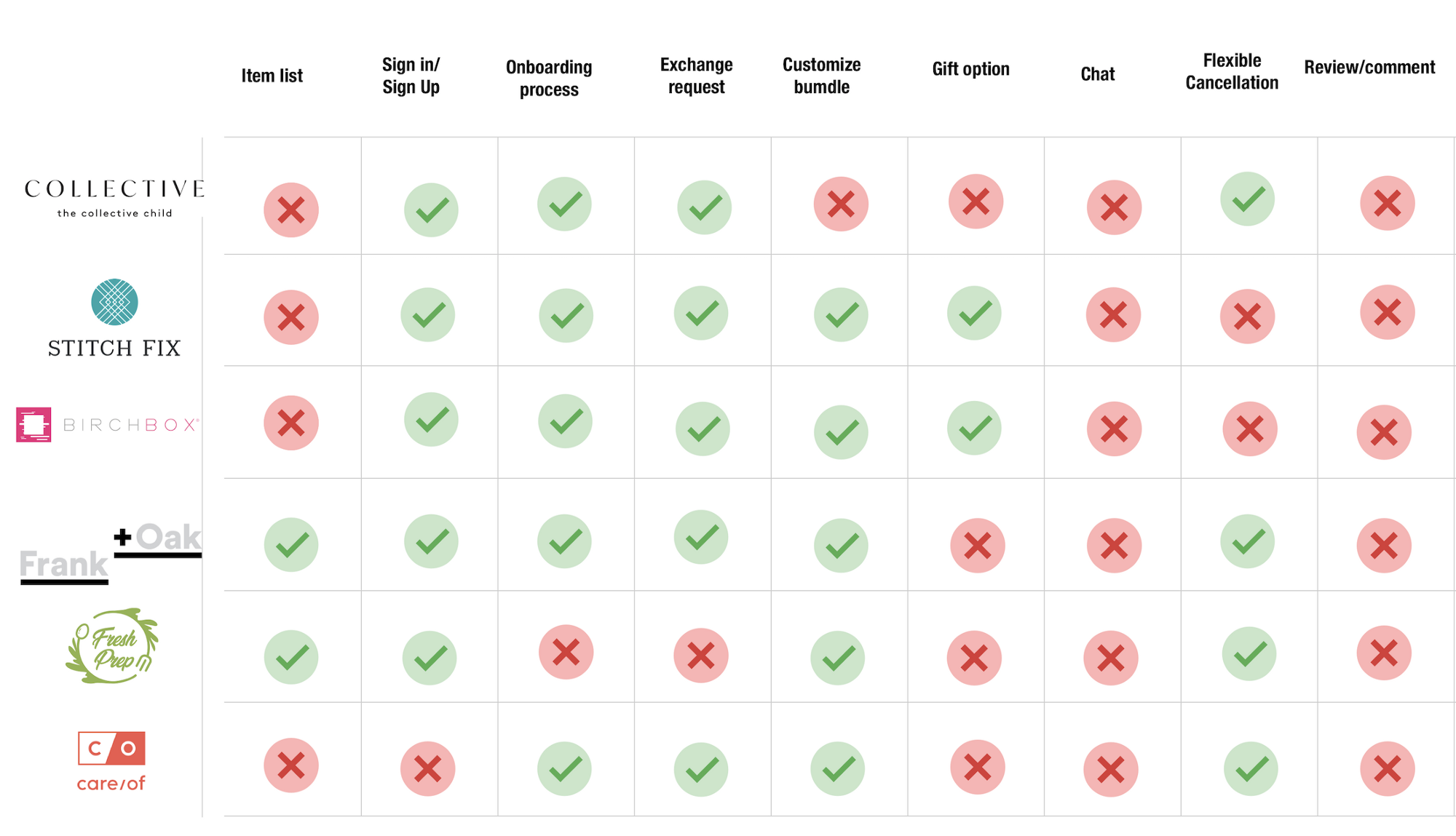
Through our analysis we found that none of the companies that we compared had the feature of reviews and comments, chat options, very few that had itemized lists of their products, gifting options (where friends and family could give the members e-giftcards that would go towards their monthly subscription payments). With this analysis we came to the conclusion that having a place for users to read and write reviews on the items would offer a unique feature to the Tradle app.
The Planning: With our Tradle user Carie on our minds we began to orchestrate our research and plan our design.
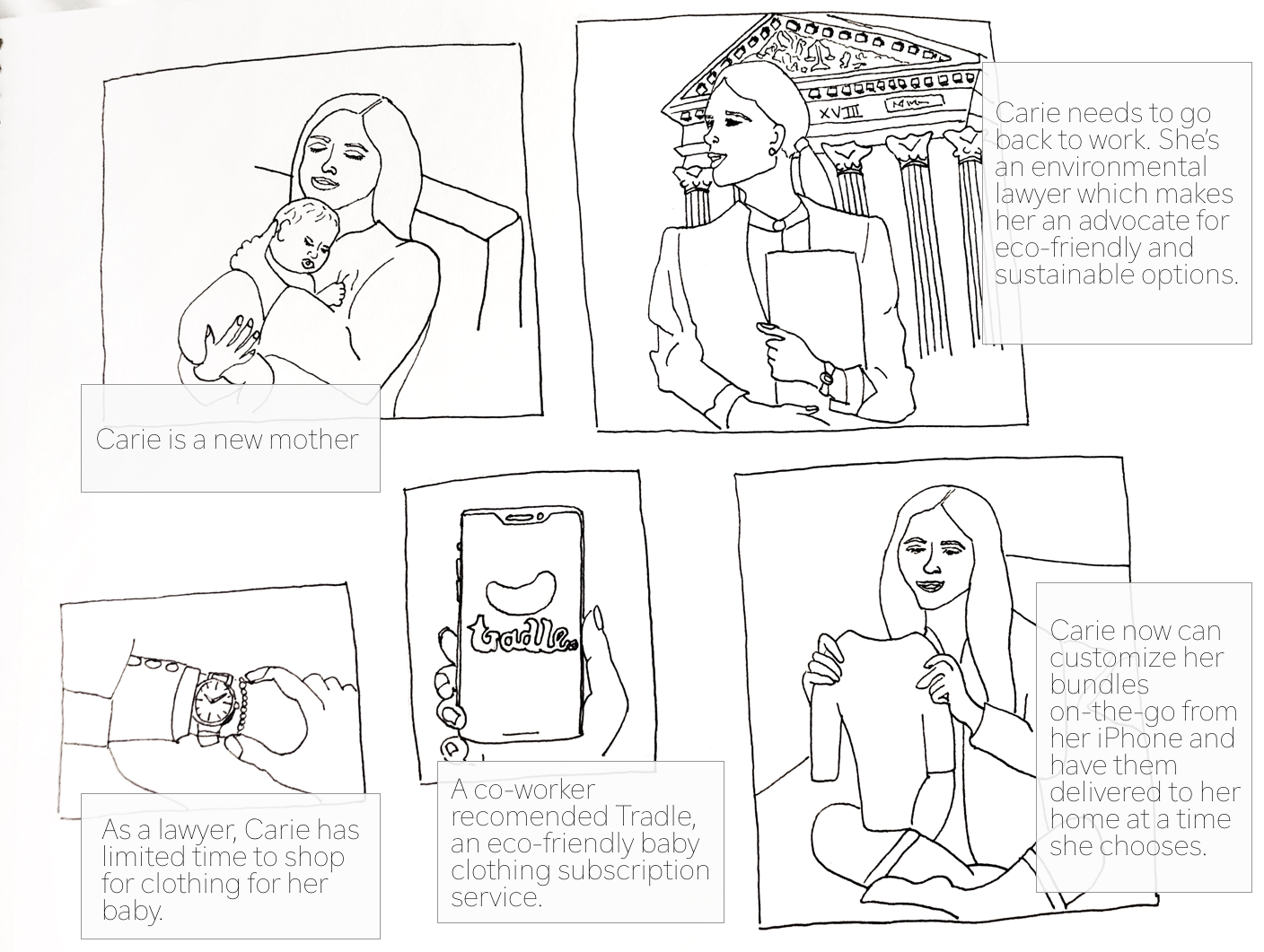
Story Board and Journey Map: We created our storyboard as Carie going back to work and not having the time to shop for baby clothes, we also emphasized Carie as being environmentally conscious. With these concerns in mind, we have Carie’s co-worker recommend to her the Tradle app.
We created a customer journey map to better show/explain Carie’s paint points and frustrations specifically regarding using Tradle’s website. We wanted to assert the Tradle app as being the more convenient way of using their subscription service.
User Scenarios: Writing user scenarios helped us determine what we wanted on our feature list for the Tradle app. This scenario shows us how Carie could potentially interact with the Tradle app throughout her day.
- Carie has just subscribed ‘Tradle’ via their website. She has already chosen her subscription option and has received her first clothing bundle (20 baby clothing items).
- It’s been a month and Carie notices before leaving for work that her baby looks a little snug in her onesie. (Feature: create new bundle)
- Carie is curious about a certain item she is debating whether or not she wants to add to her new bundle. (Feature: ratings and reviews)
- After Carie has selected her twenty items and has reviewed her newly customized bundle she is ready to determine when she would like to exchange her old bundle with her new one. (Feature: date and time scheduling)
MVP and Feature Prioritization: How we went about figuring out our MVP (minimal viable product), we used The Bucket Method to prioritize the features we wanted the app to have.
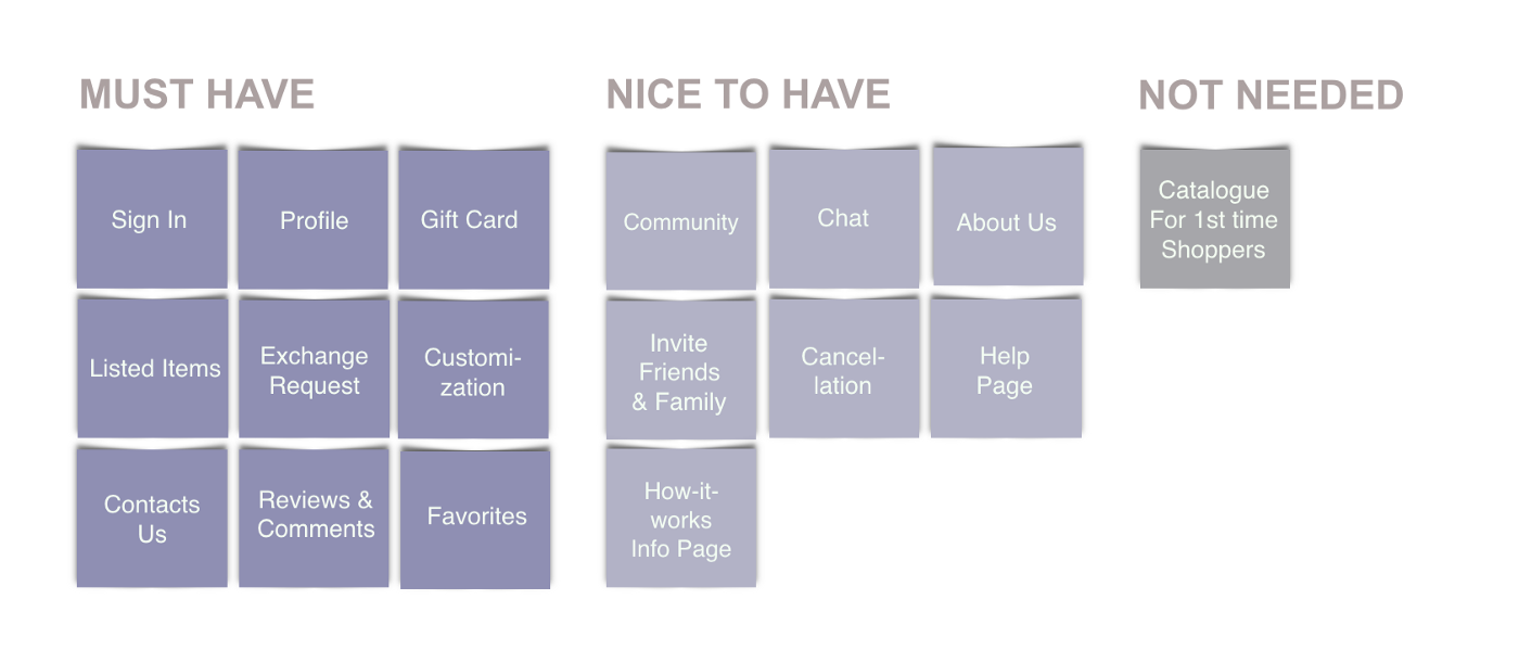
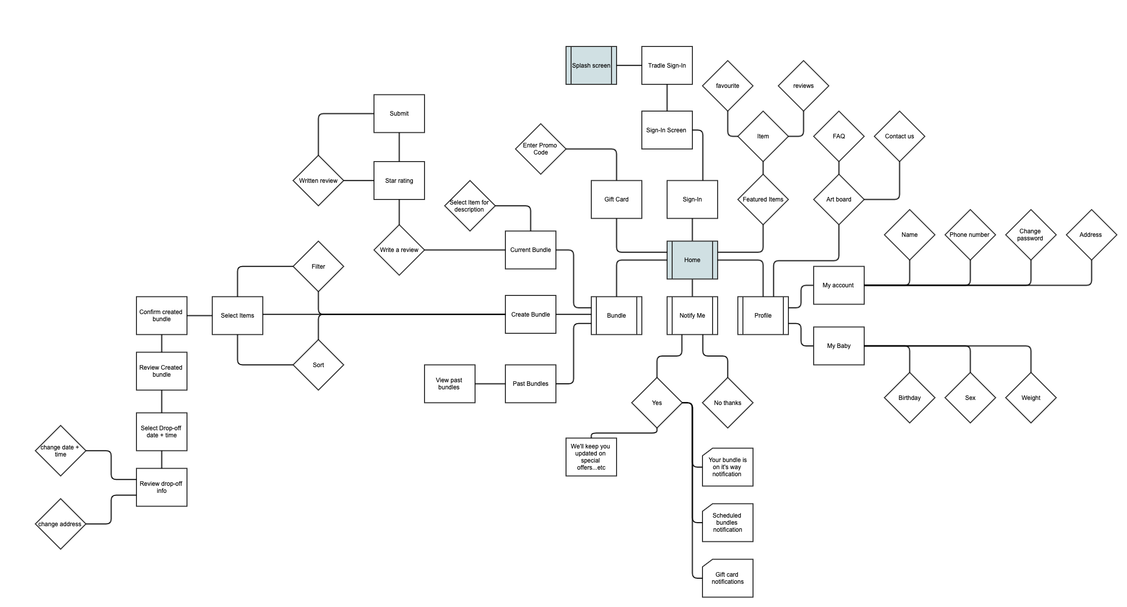
User Flow: Keeping our user in mind (Carie York), we created a user flow with our “must have” features. This user flow has multiple paths that Carie can go down to start and complete a task. It also helped our UX team determine the screens we would need to create for the Tradle app.
Design: With our user flow in mind we started to figure out how we wanted the Tradle app to look, we took a lot of points into consideration such as who our user is and any accessibility issues we might have to face. We had already determined in our research phase what type of phone our user would using (Android or iPhone), it turned out that everyone we interviewed used iPhone.
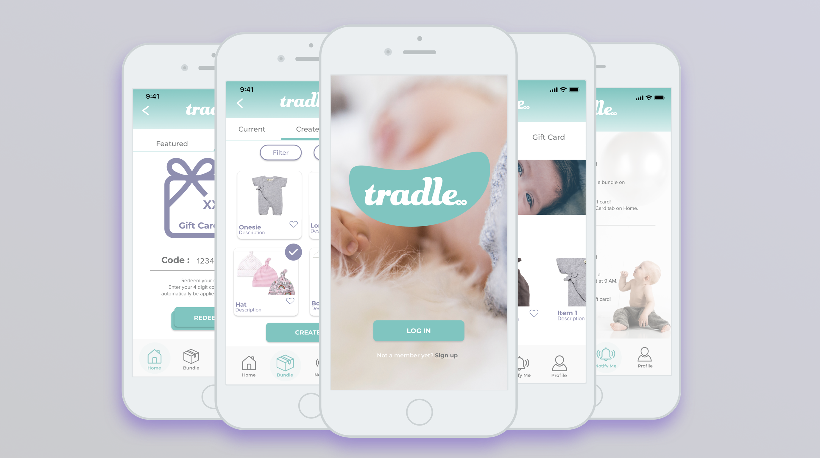
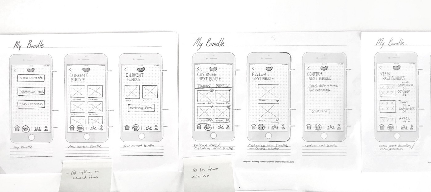
We created our paper prototypes with having our feature icon tab bar at the bottom of the app to maximize user accessibility.
Testing: We put our low-fi paper prototypes to the test by getting our fellow colleagues/classmates tasks to we wanted them to complete.
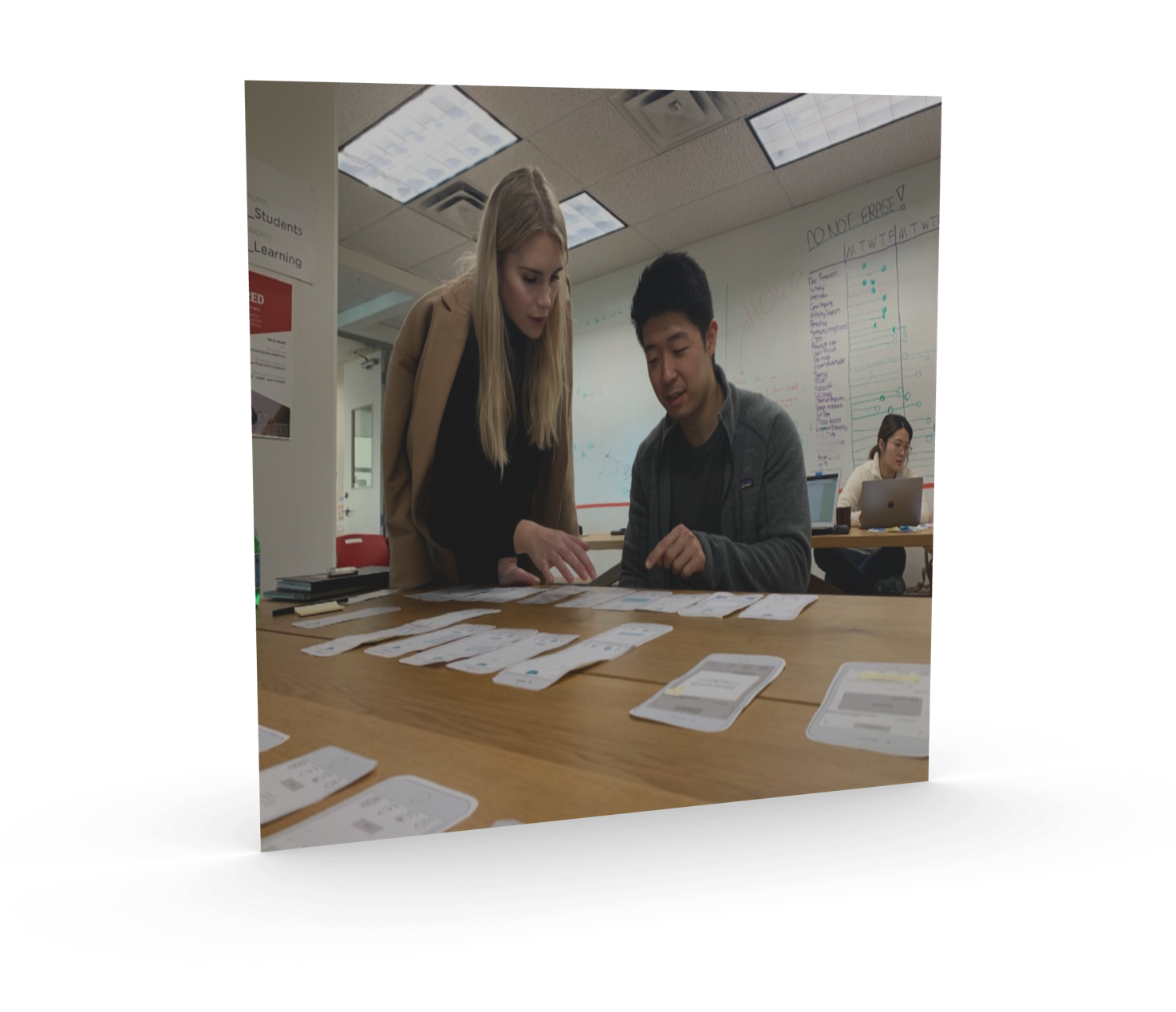
The feedback we received from our testing was very insightful and helped us determine what changes we would need to make in order to create a more user friendly app that would get our user from point A to B with ease and efficiency.
The changes that we needed to make were just a few small tweaks such as re-wording a few of our features (we changed the ‘community’ option to ‘notify me’), getting rid of some steps and then adding a few additional steps (we added an option to ‘favourite’ items in the feature list). After our revisions we had a few of our users test our prototypes again, needless to say the outcome was much better. Everyone was able to go through all of our features with no hesitation.
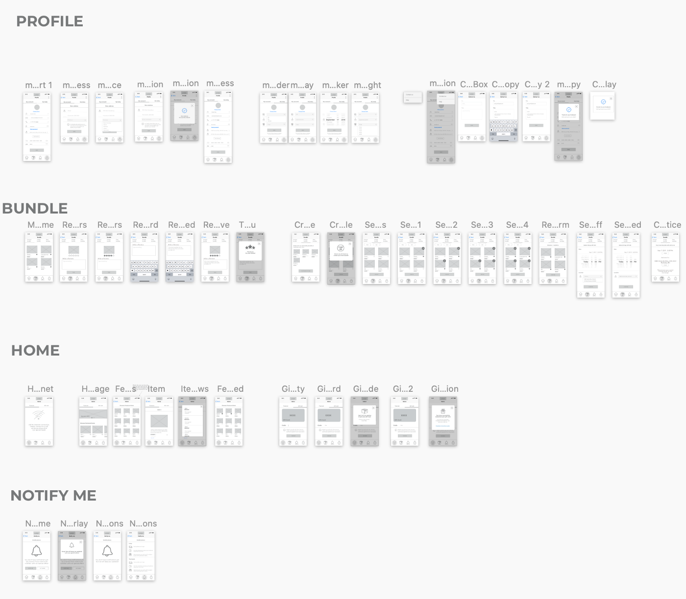
Mid-Fi Prototype: After we completed our testing and revised our paper prototypes we moved onto creating mid-fi wireframes in Sketch.As you can see, our team created the app with minimalism in mind, we wanted something simple that wouldn’t complicate or confuse the user. We wanted the user to be able to navigate through the app with ease. Having the navigation tab bar at the bottom for easy accessibility. We needed to create around 50 wireframes in order to properly show the features that we created.
Conclusion: This project took our team two and a half weeks to complete, there were a lot of extra features we would have liked to add but we just didn’t have the time for it and we had to keep in mind that we were creating an MVP.
What Did I Learn?: There were so many things that I learnt throughout this project. To list a few: user accessibility, typography, working within a team, managing work flow, etc
Final Thoughts: Collaborating with other UX designers I’d say would have to be the biggest challenge, making sure that everyone was on the same page and understood the tasks that needed to be completed, making sure that all of our screens aligned properly and that everything was prototyped correctly in the order agreed upon. Staying focused on the task at hand and not getting caught up on potential future features. With everything said and done, communication was our greatest asset to successfully complete this project.