Introduction: Coding is a concept that I’m still trying to wrap my head around. I think that I have at least a basic understanding of coding in HTML and somewhat CSS but anything more than that I’m a little lost. This lack of coding knowledge made the project of creating a responsive website for a site that was dedicated to developers a little more challenging but optimistically very educational.
What is CodeRoad? Well, there’s a hint in the name. CodeRoad is a platform in which people can learn coding through tutorials and where they can create their own coding tutorials. All of the tutorials (taken or created) are done in a plug-in in Visual Studio Code Editor.
Understanding the Challenge: My team was tasked with creating a responsive website for CodeRoad. We needed to create a glorified brochure to entice potential users into wanting to take and more importantly create tutorials within the VS Code Editor. During the initial stakeholder meeting our client expressed his goals, needs, and wants to us. Our Client expressed his three main goals for the design process to us:
- Create a website to promote and explain CodeRoad to users.
- Create a site to host descriptions of tutorials.
- Logo and branding for the application
With these goals in mind our team set out to start our research.
The Research: Methods used: organizational/domain research, survey, user interview, contextual inquiry, affinity mapping, comparative/competitive analysis, information architecture
Research Goals:
- To determine the demand for coding tutorials as well as for creating coding tutorials.
- To determine how current coding tutorials are taken and created.
- To understand what the average developer is looking for when taking and creating coding tutorials.
- To identify the areas of improvement that other coding tutorial websites could have (free tutorials, users being able to download and share tutorials)
Our team wasn't given any prior research as the client had not conducted any yet. We also didn’t have much content, just some general information that the client had provided for us on his mock-website he had created through github. Our UX team set out to conduct our own research by creating surveys and interviews.
Survey and Interview Findings:
“When tutorials are updated often it really improves the overall quality of the tutorial, there’s nothing worse than taking an outdated tutorial.”
The key findings in our surveys were that the coding world is dominated by men. Out of the People who took our survey 76.9% of them were male where as only 23.1% were female. The majority of people surveyed learnt how to code via an online platform. The most popular websites that people use to take coding tutorials are Codecademy and Udemy. We asked the interviewees and people who took the survey what they liked most about these tutorials and this is what they said:
“Code School provides you with real life projects and experience. Where Code academy was best for learning the basic with proper industry coding standards.”
“Very practical and you can always go back to see the example if you did not understand the first time”
“Lots of useful information and lots of options”
And when we asked them what they didn’t like about these coding tutorial websites they responded as such:
“Tutorials may be from 2015, since then technologies have changed a lot”
“Paid content is usually greatly overpriced, unless you wait for the very frequent ‘sales’ ”
“If you have questions you can’t really get them answered as it is an online course”
Regarding creating coding tutorials, the majority of people surveyed had never created a tutorial before although over half of them said that they would be interested in creating coding tutorials.
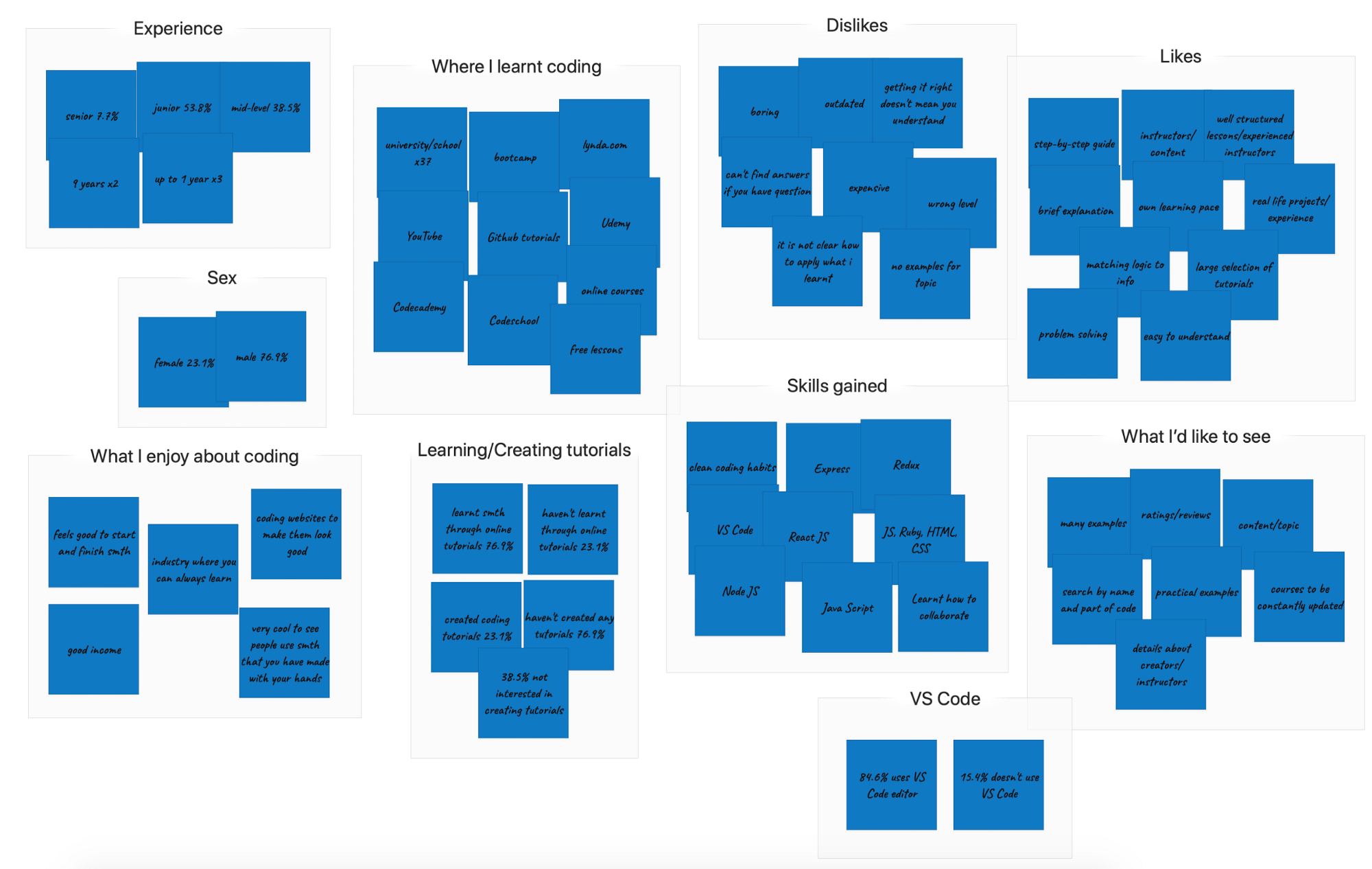
Affinity Diagram & Persona: With the data that we gathered from our surveys and interviews our UX team created an affinity diagram that grouped and organized all of our collected research.
We grouped the gathered data into categories and then again into subcategories. Through the organization of this gathered data we were able to get a clear understanding of what our potential user would be. With that information we were able to create a user persona.
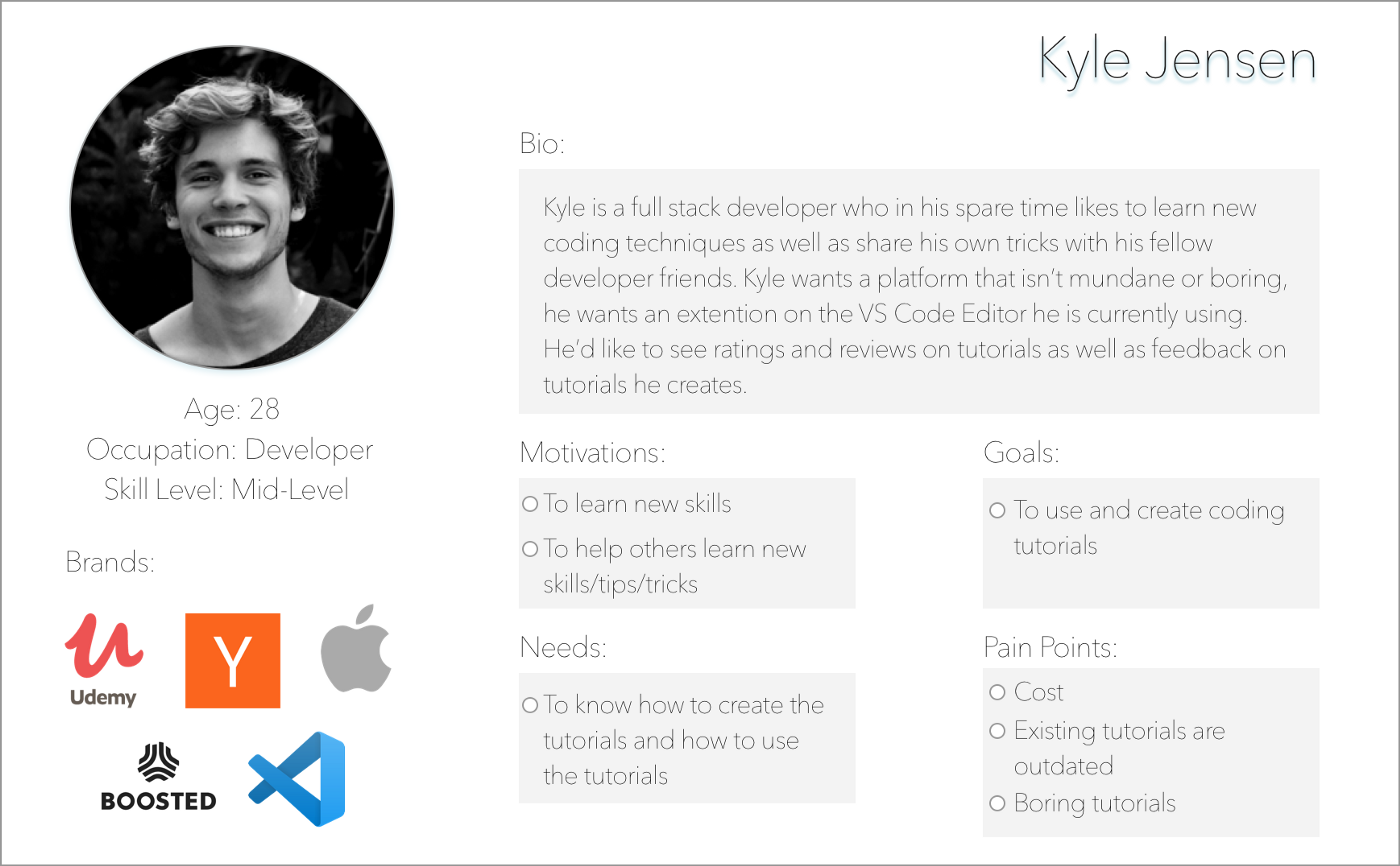
We created Kyle Jensen, a 28 year old full stack developer who likes to take coding tutorials in his spare time to learn more useful tips and tricks. Kyle is our perfect user as he is a mid-level developer who already is beyond the beginner level of coding and would be more interested in not only taking coding tutorials but also creating his own coding tutorials.
After creating Kyle we were able to figure out our opportunity statement: To have a free platform that would entice users into creating and taking coding tutorials.
Solution: To have a website that allows the user to take, create, and share coding tutorials for free with the transparency of when the tutorials were created and if they have been updated.
Competitive and Comparative Analysis: Our team spent some time researching other websites that offered coding tutorials and through this research we created a competitive analysis chart.
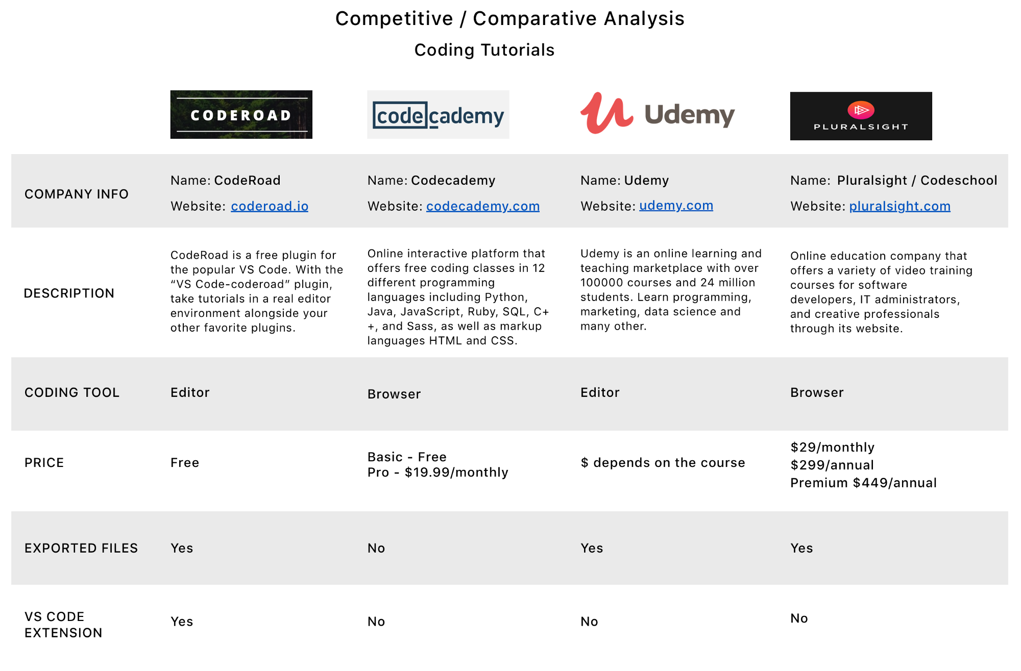
Through our analysis we found that every competitor charged some sort of fee for users to be able to take tutorials. None of the competitors used a VS Code Editor extension. With this analysis we came to the conclusion that promoting a free platform for potential CodeRoad users would be a great way to separate CodeRoad from the competitors.
The Planning: With our CodeRoad user Kyle on our minds we began to orchestrate our research and plan our design.
Customer Journey Map: We created a customer journey map to better show/explain Kyle’s paint points and frustrations specifically regarding using and creating coding tutorials with CodeRoad. We wanted to assert the CodeRoad website as the better option for taking and creating coding tutorials.
User Scenarios: Writing user scenarios helped us determine what we wanted on our feature list for the CodeRoad website. This scenario shows us how Kyle could potentially interact with the CodeRoad website to manage his tutorials.
- Kyle has just signed up to ‘CodeRoad’ via their website. He has started to browse through the available tutorials he may want to take.
- Kyle sees a tutorial he would like to take but he doesn’t want to start it right now, he’d like to save the tutorial to start at a later time/date. (Feature: Wishlist)
- Kyle is curious about a certain tutorial he is debating whether or not he wants to take, he can see a description of the tutorial but he wants to know what other users who have already completed the tutorial think. (Feature: ratings and reviews)
- Kyle has started a tutorial but he doesn’t have time to finish it. He would like to stop the tutorial and then continue at a later date, he would also like to know how much time he has left in the tutorial so that he can set aside a specific time slot in his day to complete the tutorial without interruption. (Feature: my progress)
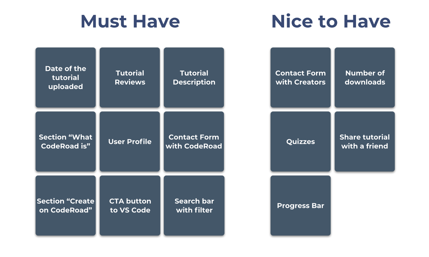
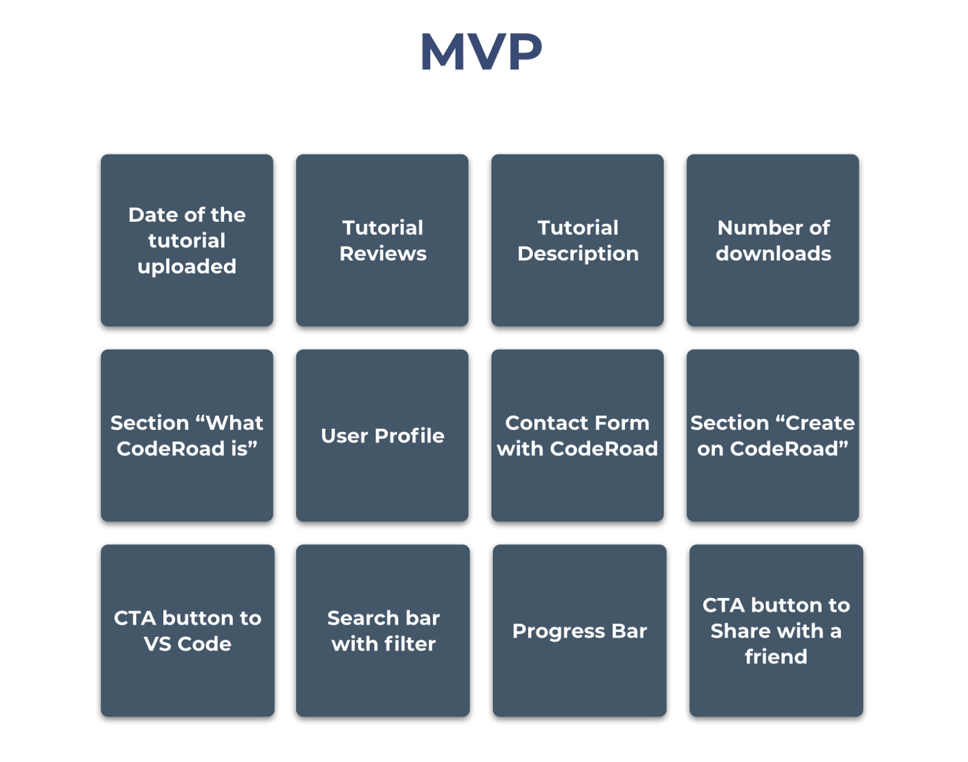
MVP and Feature Prioritization: How we went about figuring out our MVP (minimal viable product), we used The Bucket Method to prioritize the features we wanted the app to have. We could only add the must have features to our minimal viable product as we only had two and a half weeks to complete the project. We added the nice to have list into our future considerations.
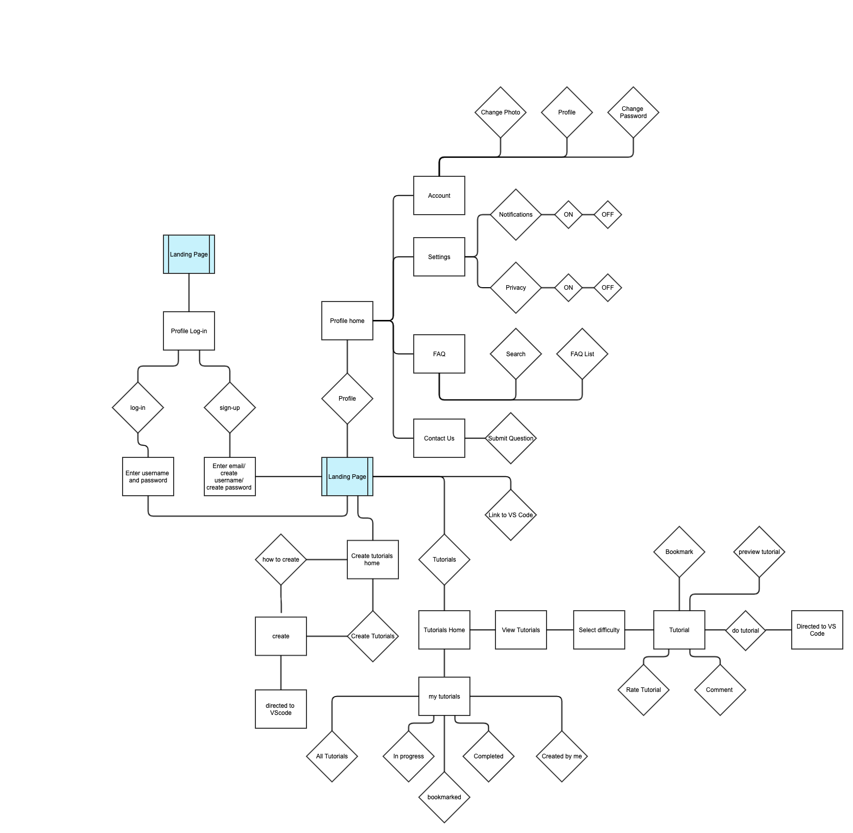
User Flow: Keeping our user in mind (Kyle Jensen), we created a user flow with our “must have” features. This user flow has multiple paths that Kyle can go down to start and complete a task. It also helped our UX team determine the screens we would need to create for the CodeRoad website.
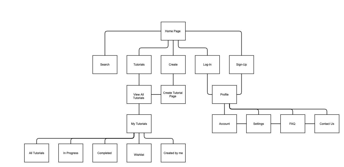
Web Flow: We created a web flow to help us determine further how our website would be organized.
Design: With our user flow and web flow in mind we started to figure out how we wanted the CodeRoad website to look, we took a lot of points into consideration such as who our user is and any accessibility issues we might have to face. We had already determined in our research phase that our users were developers and already had a general knowledge and understanding of coding and the coding language.
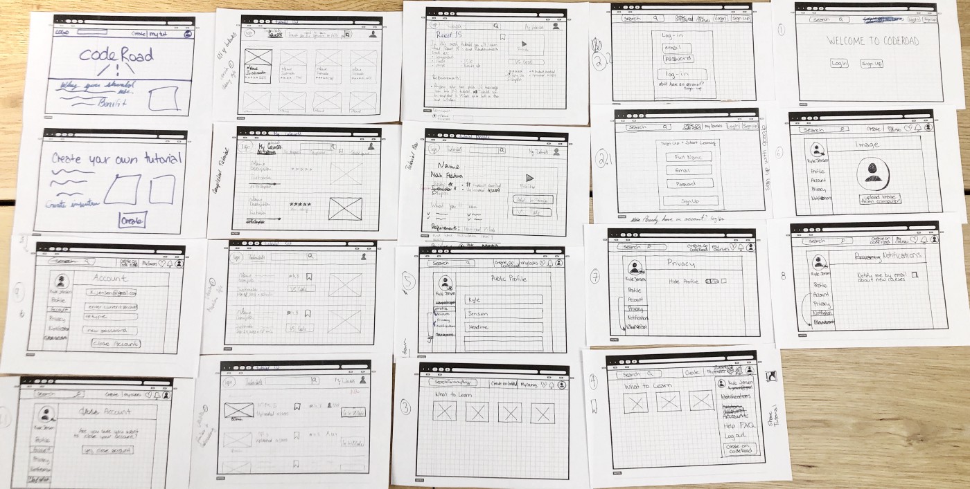
We created our paper prototypes with having our feature bar at the top of the page separated into only a few main categories. We decided to include a search bar at the top of the page as well to make it easy for anyone who would want to immediately search for specific tutorials.
Testing: We put our low-fi paper prototypes to the test by getting our fellow colleagues/classmates tasks to we wanted them to complete.
The feedback we received from our testing was very insightful and helped us determine what changes we would need to make in order to create a more user friendly app that would get our user from point A to B with ease and efficiency.
The changes that we needed to make were just a few small tweaks such as re-wording a few of our features (changing the wording of tutorial instructor to tutorial creator), getting rid of some steps and then adding a few additional steps (we added an option for the user to be able to share the tutorials that they had taken and/or the tutorials that they had created). After our revisions we had a few of our users test our prototypes again, needless to say the outcome was much better. Everyone was able to go through all of our features with no hesitation.
Mid-Fi Prototype: After we completed our testing and revised our paper prototypes we moved onto creating mid-fi wireframes in Sketch.

As you can see, our team created the app with minimalism in mind, we wanted something simple that wouldn’t complicate or confuse the user. We wanted the user to be able to navigate through the website with ease. We wanted the landing page to really capture the attention of the first time user. Our goal was for any person who opened the CodeRoad website for the first time to know that they were on a site for coding tutorials.
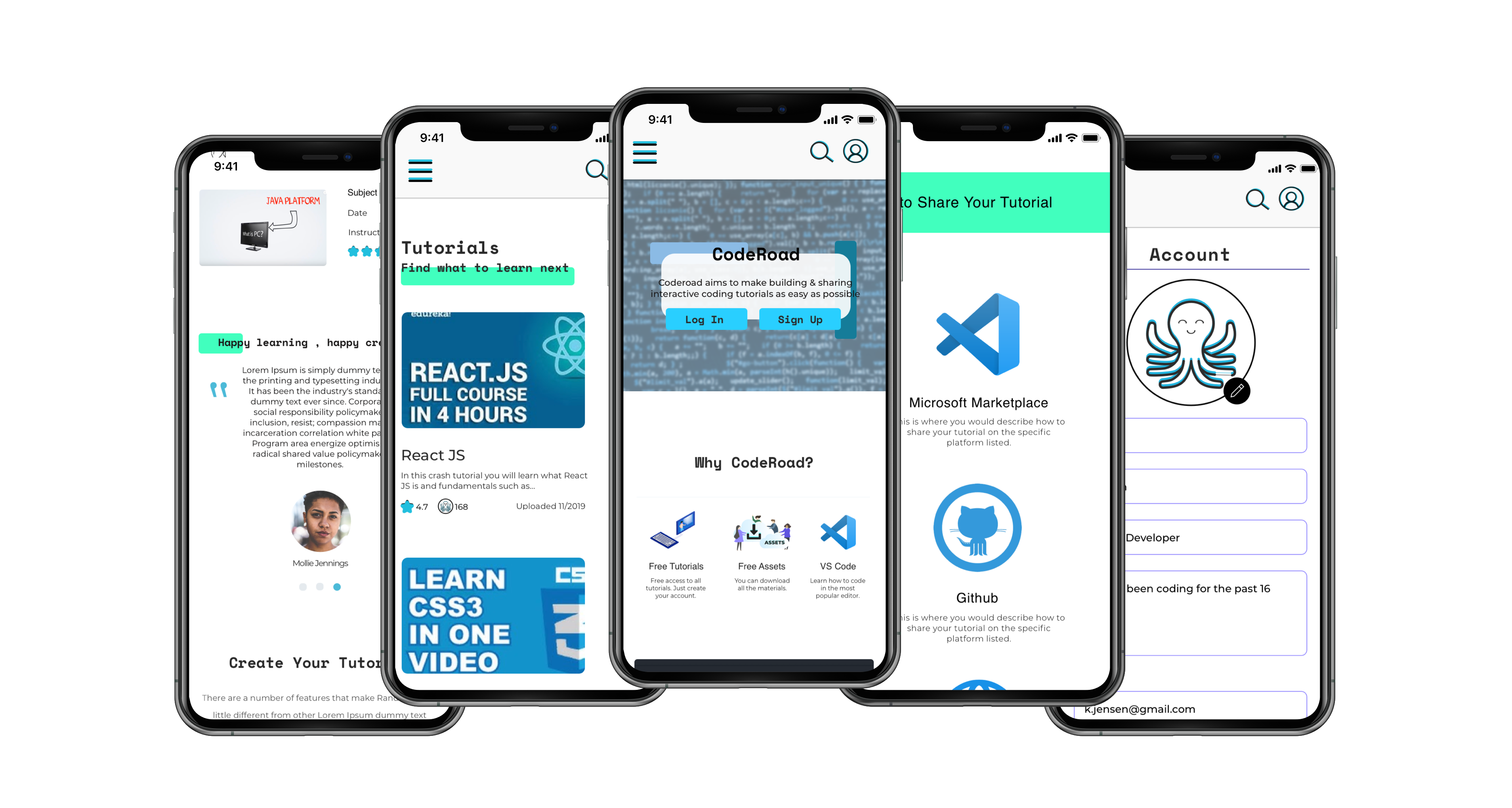
The UI: This is what our final project looked like after the UI skinned all of our mid-fi wireframes.
Conclusion: This project took our team two and a half weeks to complete, there were a lot of extra features we would have liked to add but we just didn’t have the time for it and we had to keep in mind that we were creating an MVP.
What Did I Learn?: There were so many things that I learnt throughout this project. To list a few: user accessibility, responsive website design, working within a team, managing work flow, etc. I also learned a lot about coding, something as I had already stated, knew little to nothing about.
Final Thoughts: Collaborating with other UX designers I’d say would have to be the biggest challenge, making sure that everyone was on the same page and understood the tasks that needed to be completed, making sure that all of our screens aligned properly and that everything was prototyped correctly in the order agreed upon. Staying focused on the task at hand and not getting caught up on potential future features. With everything said and done, communication and general optimism was our greatest asset to successfully complete this project.