Introduction: Cryptocurrency is a term that has been used frequently within the past 10 years and even more so since 2017 when bitcoin reached an outstanding percentage increase in value. I’m sure everyone today has heard of cryptocurrency and in particular, Bitcoin - but most people don’t actually know what cryptocurrency really is and how it uses the blockchain to create a decentralized form of currency exchange/banking. Most people use cryptocurrencies as a way of high risk/high return investment. Until recently I didn’t know much about cryptocurrency and even less about the blockchain, I wish I would have had this new found knowledge before I had invested in volatile crypto coin back in 2017.
My team and I were tasked in creating a responsive website that would help people better understand cryptocurrency in it's entirety.
What is Coin Map? — Coin map is an interactive website that teaches the user all about cryptocurrency from the various different sectors of cryptocurrency coins, to the terminology used when buying, selling, and viewing the crypto market.
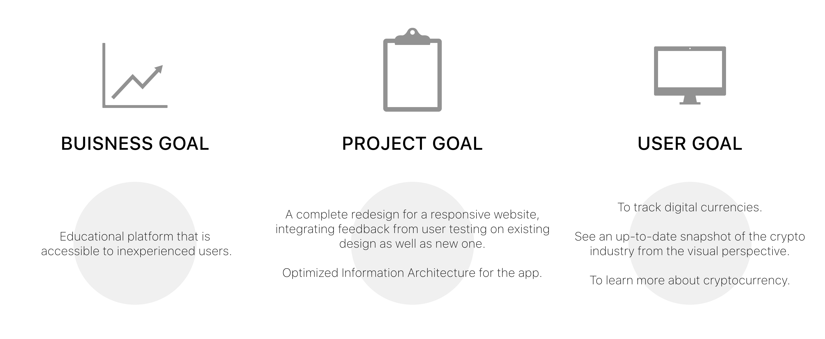
Understanding the Challenge: The challenge our team had to face was that we needed to design a responsive website to create the best learning experience for the potential user. Our client expressed to us his goals, wants, and needs. Our client gave us his four main goals he wanted to see in this project:
- Flesh out an entire app interface and dashboard for mobile. Included features on the interface.
- Include designing a sidebar that would contain both static and dynamic content and may include simple animations for visualizing the ‘dive’ into. digital currency sectors, sub-sectors, and coins/tokens.
- Dashboard will require an account section, portfolio creation section, and a link to head back to the map.
- Provide the very best user experience for exploring digital assets
- With these four goals in mind, our team set out to conduct our research.
The Research: Methods used: organizational/domain research, survey, user interview, contextual inquiry, affinity mapping, comparative/competitive analysis, information architecture.
Research Goals:
- To determine the scope of the user
- To determine the potential users knowledge of cryptocurrency and what specifics they are looking for when learning about cryptocurrency.
- To identify the areas of improvement in pre-existing cryptocurrency educational platforms, as well, in the pre-existing coin map website.
Survey, Interview, and Contextual Inquiry Findings: When we set out to conduct our surveys and interviews on request from our client we intentionally targeted people who had already a basic knowledge of cryptocurrency, we wanted to know what websites and applications they used to check the cyryptomarkets. We also wanted to know how they gained their knowledge of cryptocurrency.
“Chartguys (YouTube) for technical analysis or Andreas Antonopolous.(Twitter, website, books) for overall.
“Telegram groups, paid group on Facebook (Nuggets Crypto Community), respected traders on Twitter(@CryptoHustle, @filbfilb)”
This information was important in understanding how we could design a functional and informative website. The key findings in our surveys and interviews were that the overwhelming majority of coins people tended to purchase were Bitcoin and Ethereum (this came as no surprise to our team as these two coins had the largest market cap and are the most popular out of all of the coins. We also found out that most people used websites to check the cryptocurrency market but a lot of people used their mobile devices to check the markets as well. For us, this information solidified our choice in choosing to create a responsive website rather than just a website or just an application. One of our key findings through our survey was finding out how people made the decision/what influenced them the most to purchase cryptocurrency. An overwhelming number of the people surveyed said that they were most influenced by online resources.
Affinity Diagram and Persona: With the data that we gathered from our surveys and interviews our UX team created an affinity diagram that grouped and organized all of our collected research.
We grouped the gathered data into categories and then again into subcategories. Through the organization of this gathered data we were able to get a clear understanding of what our potential user would be. With that information we were able to create a user persona.
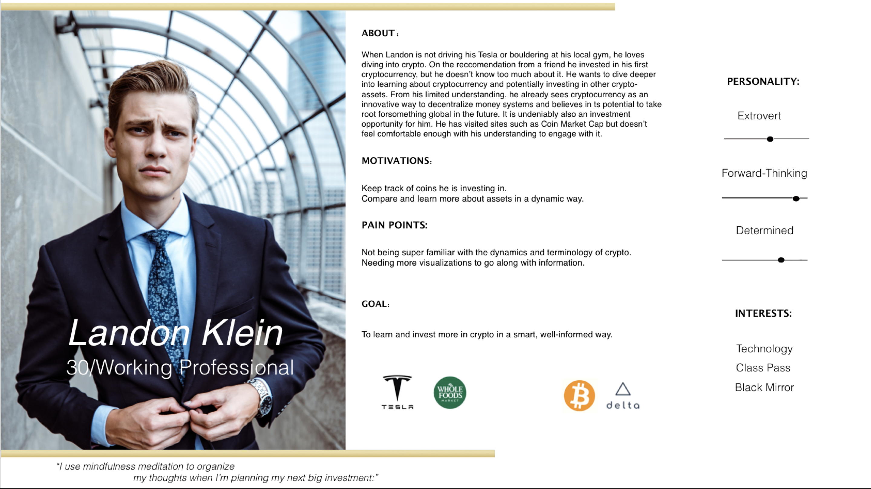
We created Landon Klein, a 30 year old working professional who liked to buy cryptocurrency as a form of investment. Although Landon enjoys the game of potentially making a lot of money off his cryptocurrency purchases, he is not very well educated in crypto as he is gets his information from random online resources, friends, and colleges. Landon would like to become an expert in cryptocurrency so he can make more informed choices in his future investments. Landon is Coin Map’s perfect user as Landon can use Coin Map to educate himself further in cryptocurrency as well as gain a better understanding of the crypto terminology used. Landon can always refer back to Coin Map for any of his cryptocurrency questions.
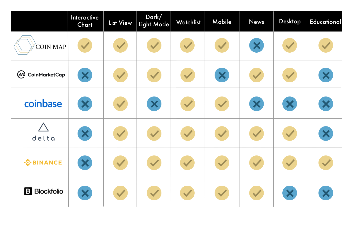
Competitive and Comparative Analysis: Through our competitive and comparative analysis we found that there was only one main competitor when it came to cryptocurrency education. The majority of other competitors were websites and applications that only catered checking crypto markets and purchasing crypto coins
The Planning: With our Coin Map user Landon on our minds we began to orchestrate our research and plan our design.
Customer Journey Map: We created a customer journey map to better show/explain Landon’s pain points and frustrations specifically regarding figuring out how to navigate through other cryptocurrency websites. We came up with solutions to the problems that Landon may encounter when navigating through these websites. These solutions would then be implemented to the Coin Map website, creating an optimal user experience for Landon.
User Scenarios: Writing user scenarios helped us determine what we wanted on our feature list for the Coin Map website. This scenario shows us how Landon could potentially interact with the Coin Map website to learn about A specific crypto coin.
- Landon has just landed on the Coin Map home page via his laptop computer. He immediately sees the interactive version of Coin Map but today he would like to just see a list view of all of the coins (Feature: List View)
- While browsing the crypto coins through the list view Landon sees a term that he doesn’t understand so he hovers above that term and a short description appears. (Feature: Description)
- After seeing a summary of the term he is unclear of, Landon feels like He also as the option to click and learn more than just the summary of the term. (Feature: Glossary)
- Landon is looking for more information about a specific coin and he doesn’t want to go through the entire list to try to find it so he instead types the coin he is searching for in the search bar. (Feature: Search)
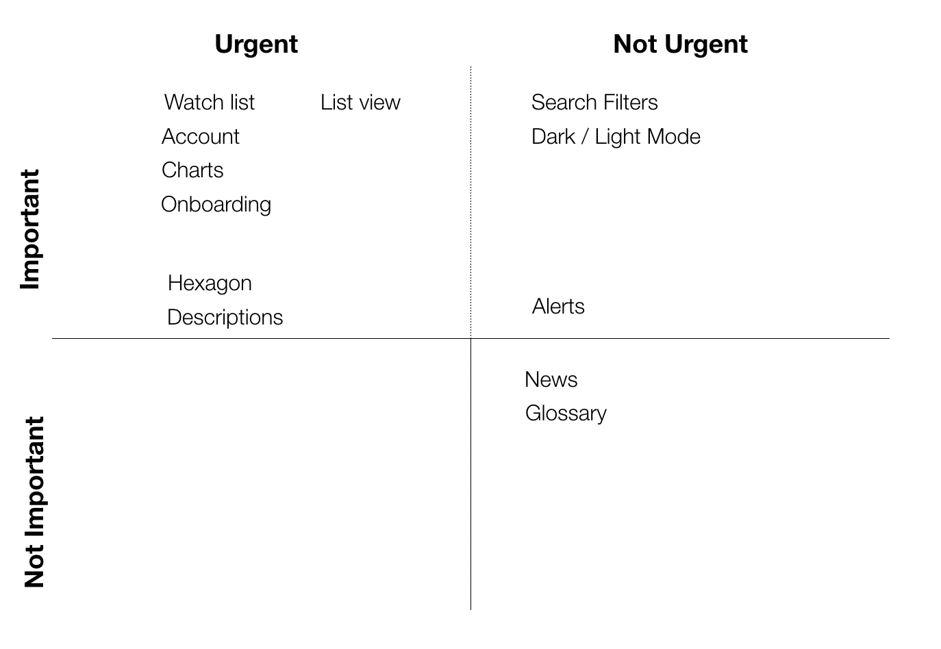
MVP and Feature Prioritization: Our team used the Eisenhower diagram to prioritize which features we would need for our MVP and which features were unnecessary and could be potentially added later.
We listed everything in the top left-hand corner of our chart that would be considered both urgent and important as our definite must haves on our feature list. Everything under the not urgent and not important box in the bottom right-hand corner we considered if we had extra time to add these features but they were not a priority and more of a nice-to-have.
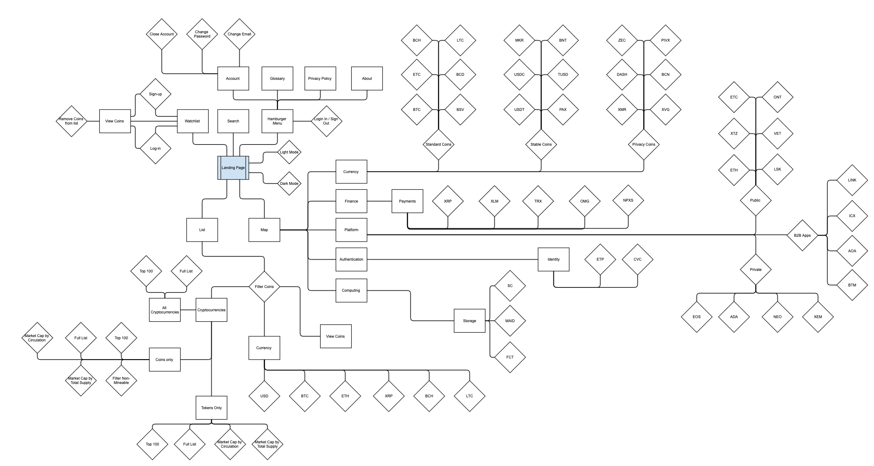
User Flow: After we determined which features we knew we wanted to have on our website we set out to create a user flow to define all of the different paths our user (Landon) could potentially take while on the Coin Map website. Having the user flow also helped our team determine how many screens we would need to create our wireframes.
Design: With our user flow and feature list in mind we started to figure out how we wanted the Coin Map website to look, we took a lot of points into consideration such as who our user is and any accessibility issues we might have to face. We had already determined in our research phase that our users had some basic knowledge of cryptocurrency but were not by any means experts.
We created paper prototypes of our design and through ample testing with potential users. The feedback we received from our testing was very insightful and helped us determine what changes we would need to make in order to create a more user friendly app that would get our user from point A to B with ease and efficiency. The changes and additions that we needed to make were very minor. We decided to add a feature that would make it easier for the user to navigate through the interactive educational tool of the Coin Map website.
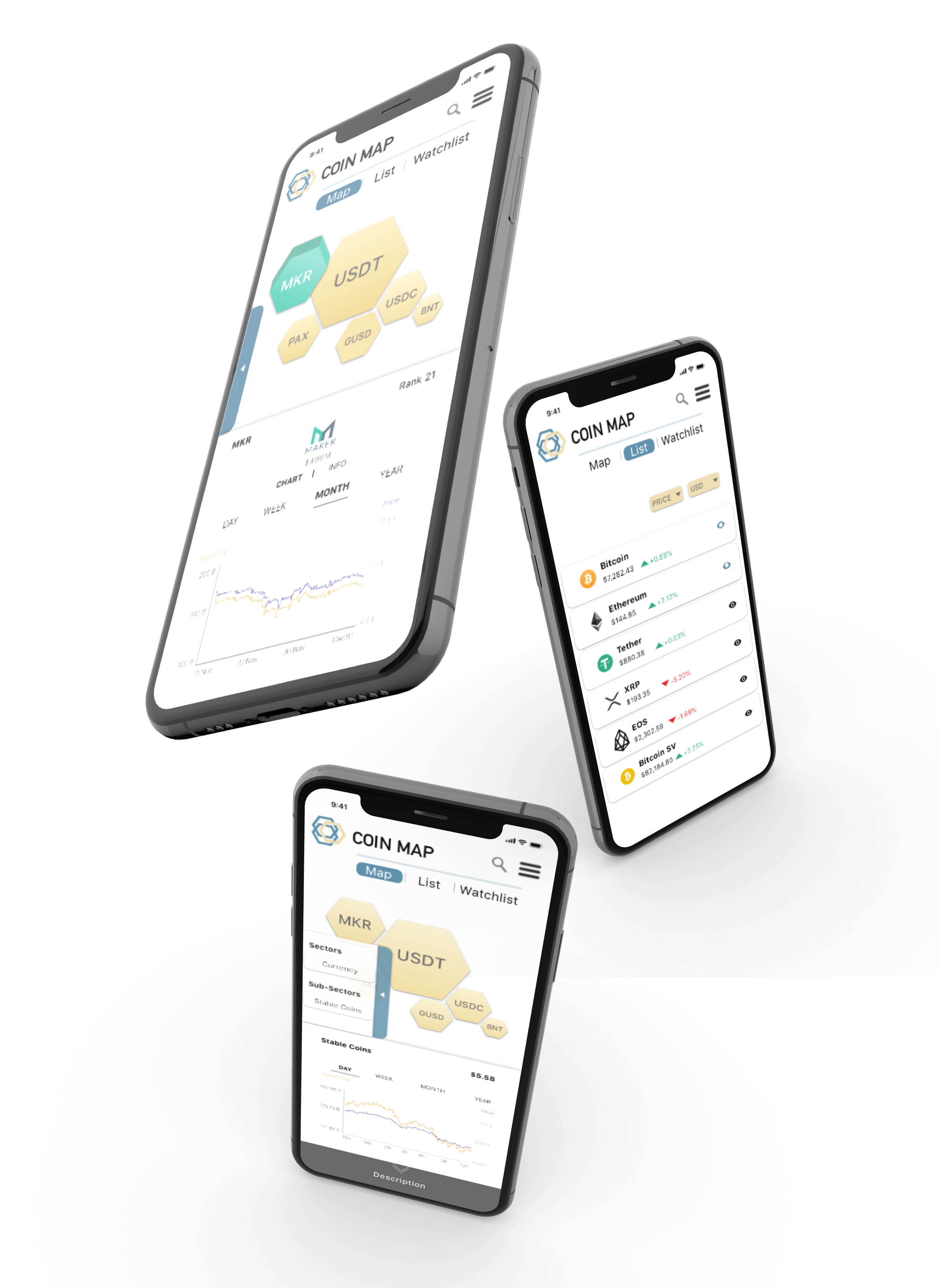
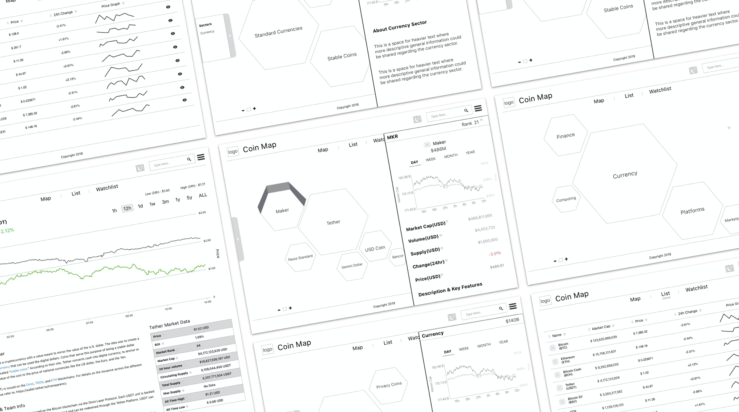
Mid-fi Wireframes: After we completed our testing and revised our paper prototypes we moved onto creating mid-fi wireframes in Sketch. As you can see, our team created a website that would draw the user into wanting to learn more about cryptocurrency. We wanted something simple that wouldn’t complicate or confuse the user. We wanted the user to be able to navigate through the website with ease. We wanted the landing page to really capture the attention of the first time user. Our goal was for any person who opened the Coin Map website for the first time was for them to start clicking through the interactive learning tool to dive deeper into the types of coins and the crypto terminology.
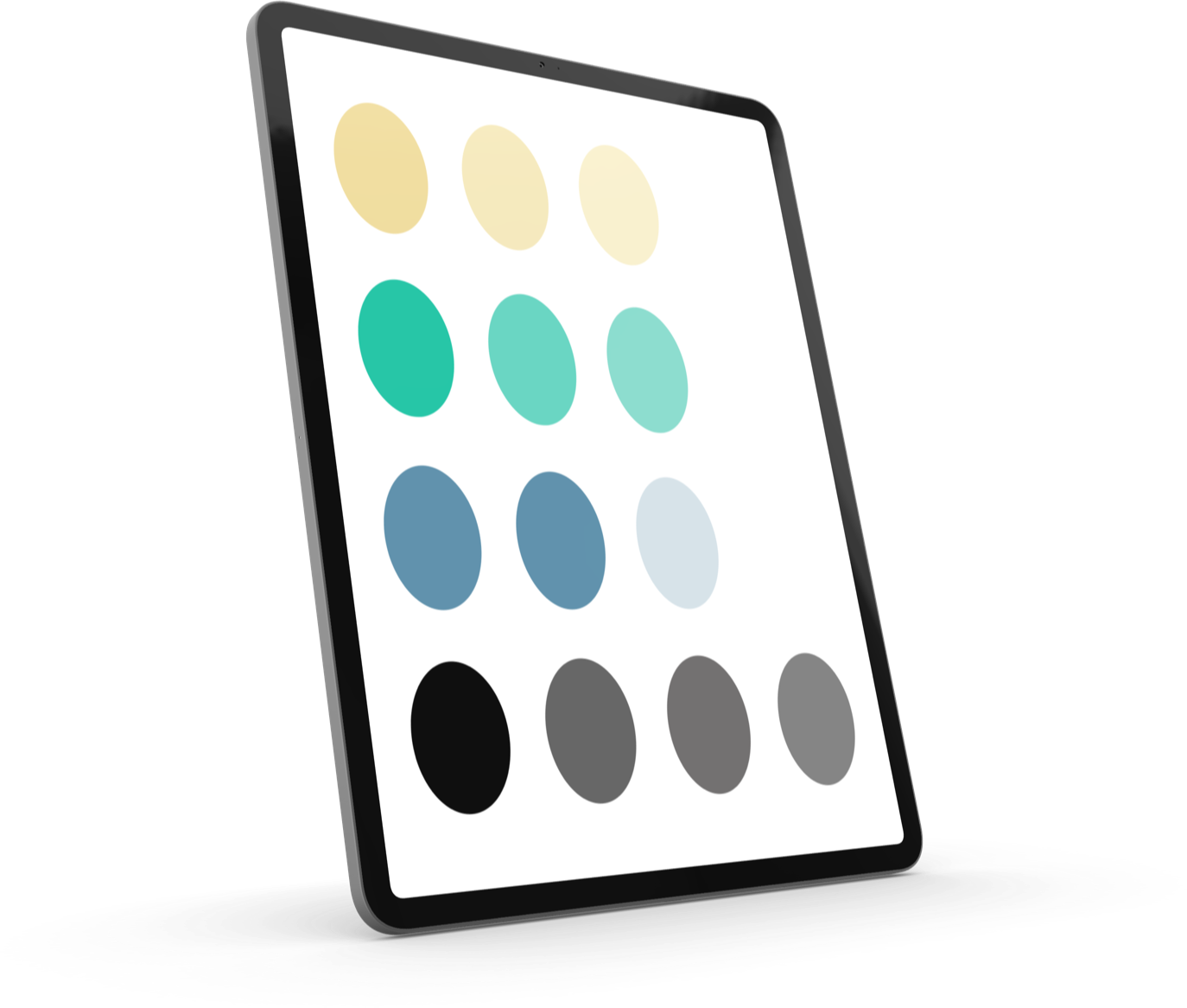
The UI: After completing our mid-fi wireframes our team started to skin the wireframes. For our hi-fi’s we needed to figure out a colour direction. Our team decided to go with this set of colours. We reached this decision by testing a series of colours with crypto buyers and people with a general knowledge of cryptocurrency. They all preferred the colours shown. Our users felt that these colours were more stimulating and reminded them of cryptocurrency, they said that the colours had a modern, clean, and digital feel.
Conclusion: Our team had a limited amount of time to complete this project. To be exact, from start to finish we only had 12 days. Our client was only expecting a lo-fi presentation but our team worked day and night to deliver a high-fi product that we were all very proud of creating. We did an extensive amount of research in both our UX and UI design. At the time, no one on our team had any UI experience. Through trial and error I think we were able to deliver a great product.
What Did I Learn?: Although it is nice to work with a small team because it's much easier to coordinate the work, there are also a few cons - This was the first project that I worked on were we didn't have a UI team to skin our mid-fi wireframes. We wanted to deliver an exceptional product to our client, this forced our team to become quite well versed in time management.
Final Thoughts: With time constraints, extra work, and teaching ourselves how to create a visually appealing user interface I am very proud and happy with the product that we delivered to our client. Although limited, our team worked exceptionally well together in collaborating our ideas and splitting the workload amongst ourselves. We had excellent communication between the four of us which allowed us to work efficiently.